Data Visualization: Interactive Dashboard
- Ziyu Tang

- Feb 10, 2020
- 4 min read
Updated: Mar 15, 2020


Data explanation:
We searched this superstore dataset about the sales and profits of superstores under 17 sub-categories among different cities in China and the United States from Kaggle.
In particular, the original data did not divide provinces of China into regions, so we divided all provinces into four regions according to the definition of the National Bureau of statistics of the P.R. China.
Insights:
These dashboards compared sales and profits of superstores of China with that of the U.S., showing that the performances were much better in China.
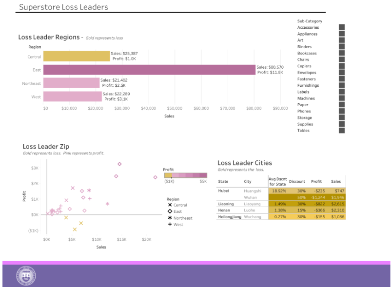
First of all, 3 of 4 regions in China was making profits, except The Central had a loss of $1,000 which was not too much. The East was definitely a superstar performer, generating the most sales of more than $80,000 and making the most profit which over $11,000. The same situation can be discovered from the Loss Leader Zip graph, only 3 points were below x axis showing the status of loss, and all of them were from the Central China. Most of the points were above the x axis showing the status of profits-making, and the East performed the best.
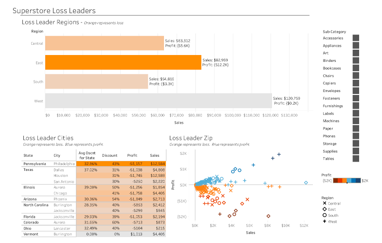
However, the performance of the U.S. was unsatisfactory: Only the West made profits. It had more than $120,000 sales ranking the first but only gained $200 as profits, indicating that although the overall superstores in the West was making profit, many superstores were actually in a state of loss. Things even worse when looking at other three regions. The central, South and East were all in a state of loss. The East was last out 4 regions with the loss taking up 15% the sales. What’s more, the eastern region ranked second in terms of sales, and its high loss rate also meant that it ranked first in terms of loss volume. The Loss Leader Zip showed a more direct relationships between sales and profit among four regions. Obviously, the West U.S. performed the best that most of its points were above the x axis which represented the 0 profit, indicating that it made profits. Furthermore, the point with the highest profit and comparatively high sales was from the West. By contrary, we can see that the East performed the worst that most of its points were below the x axis, indicating that it was losing money. Moreover, the point with the highest loss and comparatively high sales was from the East. Finally, most of the points are concentrated near the x axis, showing mediocre performance.
Can we turn losses into profits by giving more discounts? The answer is no.
Looking at the Loss Leader Cities, we can find that the loss-making superstores all gave discounts more than 30%. Conversely, the superstore in Burlington generated profit over $1,000 even without any discount. This means that the discount may only promote sales, but it will not help profits much.
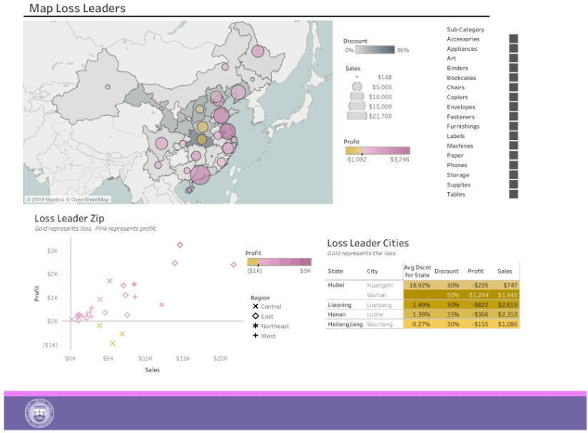
When looking at the Loss Leader Cities of China, we confirmed the conclusion we previously drew that the superstores can’t carry back of loss by giving more discounts. From the perspective of geographic performance, only 5 cities in China was losing money. However, all of them offered discounts, and Wuhan, with the most generous discount which was 50%, lost the most money which was $1,244. Thus, it seems that offering the discounts didn’t help turn losses into profits, even it may lead to the loss which needs to be further verified.
The map gave us more information.
For China, we can see that only the circles in the Central were gold, indicating that only the Central was in a state of loss. The performances of sales and profits present geographical differences. Explicitly, the performance of the eastern coastal areas was significantly better than that of the inland areas, mainly reflected in more sales (bigger circles) and profits (darker colors).
In the United States, the West had bigger, blue circles represent high sales with profit while the East had several small and medium, orange and red circles represent comparatively lower sales with loss.
In conclusion, performances of sales and profits of superstores among different cities in the U.S. were poorer compared with China and had regional differences. Offering discounts was proved to be an ineffective solution
Reflections:
The most difficult part of designing this interactive dashboard was making the map. The map contained several dimensions, including average discounts displayed in grayscale, sum of sales demonstrated by size of circles, sum of profited colored differently, and the longitudes and latitudes of the provinces. To show all these dimensions within a map, we needed to use latitude twice in the rows and add different variables into two latitudes, like adding layers in ggplots.
Furthermore, color choosing was another difficult part. The special feature of this dataset was that the positive and negative numbers of profits should be expressed in different colors in the same table, and the colors needed to change continuously according to profits amount. Therefore, the colors of visualizations needed to be reset to ensure that negative numbers are the same color (such as gold), and positive numbers are another same color (such as purple), and the larger the profit amount, the darker the color.


Comments